Try Demo
Talk to Adoption Engineer
Whitepaper
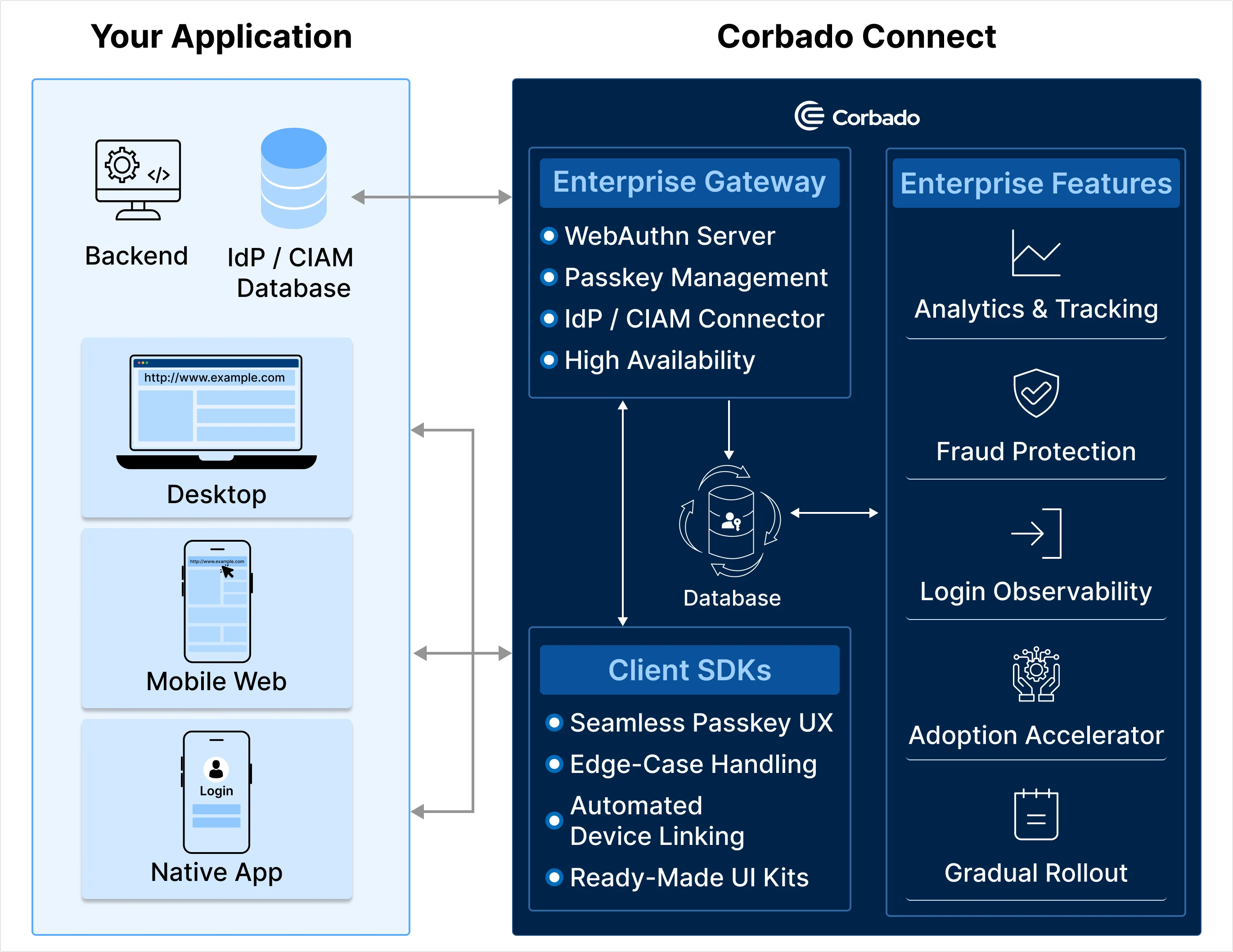
1. Introduction
Enterprise passkey integrations can be complex especially when you have multiple systems, existing authentication flows, and varied compliance requirements. Corbado Connect aims to simplify this by providing JavaScript-based UI components that work seamlessly in any front-end environment. These components handle the heavy lifting of passkey ceremonies, fallback logic, and user interactions, letting you focus on building great user experiences. Corbado’s approach is lightweight: you embed our JavaScript library or use npm packages to mount passkey related components in your code. This guide shows a short introduction to the two core components CorbadoConnectAppend and CorbadoConnectLogin and also briefly introduces CorbadoConnectPasskeyList for passkey management. This article focuses primarily on the automatic login approach tailored for identifier-first implementations. If you’re interested in learning more about implementing passkeys using our passkey button approach with Corbado Web UI Components, feel free to contact us directly for further details.2. Components as one part of the Enterprise Passkey Platform
3. Configuration Supported by All Components
Each Corbado Web UI Component supports a common set of configuration parameters:| Name | Description | Required | Type |
|---|---|---|---|
projectId | The ID of the Corbado project. | ✅ | string |
frontendApiUrlSuffix | The Corbado Frontend API to connect to. You can specify whether the component connects to the staging or production environment. | ✅ | string |
isDebug | If set to true, the Corbado Web UI Components will log debug information to the console. Useful for development, but should be disabled in production. | boolean | |
enableHighlight | If set to true, components are visually surrounded by a red box—helpful in development to understand the scope of each component in your layout. | boolean | |
flags | An object that defines default flags to include in requests to Corbado’s Frontend API. Currently, only "conditional-ui-allowed" is used; more flags may be added in the future as needed. | object |